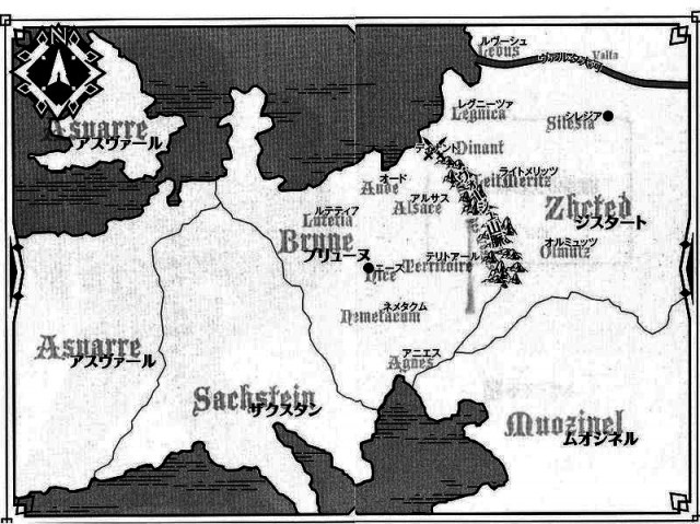
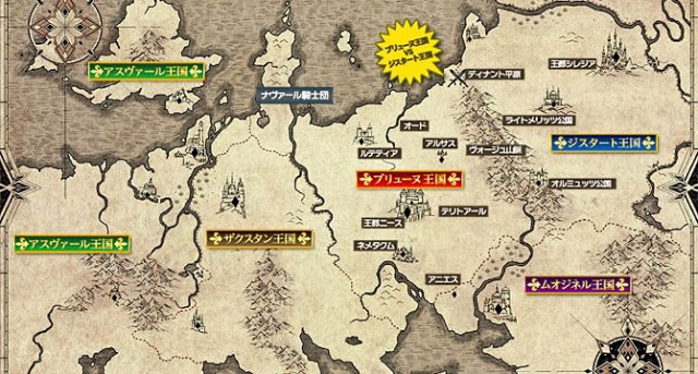
Those following Madan no Ou to Vanadis might find a map of its world useful. I found a couple at a wiki devoted to the show. (I tweaked the contrast of the first to improve readability.)
Advice to cartographers: Legibility trumps stylishness. Pseudo-black letter might look pretty on the page, but it’s a pain to interpret. Please stick to plain fonts such as Helvetica or Times Roman.


Brune looks like the crossroads of the world. No wonder it’s constantly being invaded!
If you don’t mind, I’ll be linking back to this next episode post.
Go right ahead.